![]() |
|
#1
|
|||||
|
|||||
![]() Quote:
Well with all the discussion, checked my instructions for the camera and yippie just went in altered my kelvin colour rating for my WB to 10,000k Didnt touch my iso, just went and tested to see what would happen. I see a nice difference. before
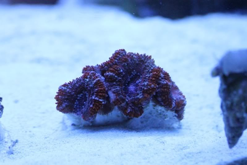
 ![]() After ![]() ![]() ![]() 
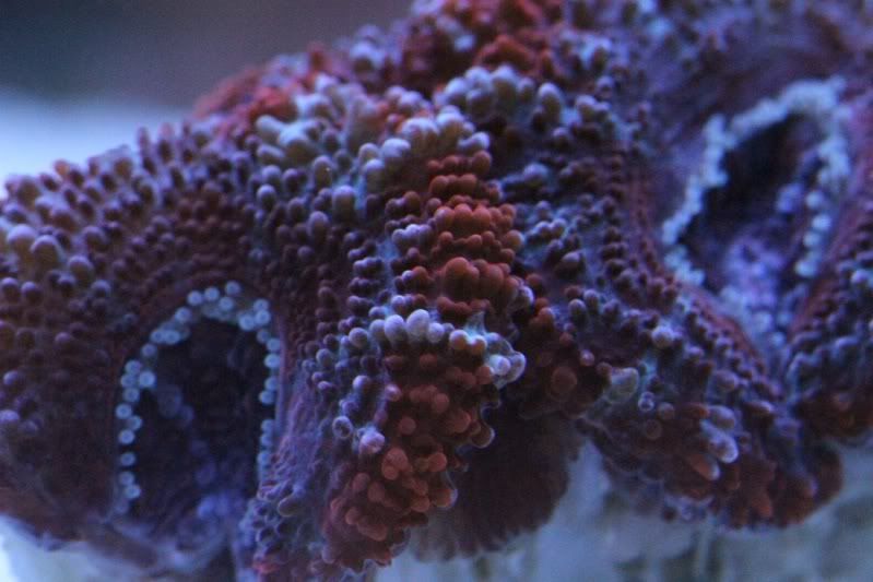
Still a little off but Now I think im heading in the right direction, and can fool around with the other settings. Hoping to maybe get some more input from others though, the more I can learn the better. And I still want to avoid editing if at all possible! (other then re-sizing in paint) |
#2
|
|||||
|
|||||
![]() Click Click
![]() |
#3
|
|||||
|
|||||
![]() It doesnt matter what camera or how much it costs. It won't perform properly unless you use it properly.
If you do use software for post, boost the contrast, brightness and slightly increase saturation. It'll make everything pop |
#4
|
|||||
|
|||||
![]() Quote:
![]() This camera is new to me, bought it for myself for christmas and Haven't had a chance yet to take it out and test all the features like I did with my old SLR. Cant find the tripod... Will play around with some of the settings now on the same 2 coral and see what happens. My only regret.... Buying a bowfront. |
#5
|
|||||
|
|||||
![]() Iso 100, f 5.0, 1/60
![]() iso 640, f 5.0, 1/60 ![]() iso 200, f2.8, 1/40 ![]() iso 400, f2.8, 1/30 ![]() iso 1000, f4.5, 1/60 ![]() iso 6400, f8.0, 1/60 ![]() Kept the same iso, fstop and speed for all these pictures but played with the following settings on the camer itself. Sharpness, Contrast, Saturation, Colour tone. Max all 4 ![]() Max all but contrast 0 ![]() Max all sharpness low. ![]() Max all saturation 0 ![]() Max all tone 0 ![]() All 0, sharpness max ![]() all 0, contrast max ![]() All 0, saturation max ![]() all 0, tone max ![]() Any of them look any better? |
#6
|
|||||
|
|||||
![]() What is your goal? True colour or brilliance ala frag sellers or somewhere in between?
True colour is obvious, what your coral looks like under white light. Super brilliant like you see on websites selling coral where the saturation is cranked up to "My Little Pony" levels or somewhere in between. Your shots are getting better and your skill with that camera has increased ten fold just today. What looks best is what you think looks best. When will we see you with a POTM? |
#7
|
|||||
|
|||||
![]() Im kinda aiming for photos that look as if you were looking right at the coral, but at the same time, having a few overly flashy ones wouldn't hurt, but my goal for now is true colour.
I just dont know what one is best representing the coral as each photo thats close is still slightly different. I think it will take a lot of playing around. I may up the 4 slightly but not all the way, takes away from the grey. I get less grey/truer colour with a lower ISO, but their too dark, 1000-2000 seems okay... ah I dont know. Now if only the fish would stay still long enough to get their picture taken. None of the recent potm themes have applied to me haha. |